


 Lorem ipsum dolor sit amet, consectetur adipiscing elit, sed do eiusmod tempor incididunt ut labore et dolore magna aliqua.
 Gravida dictum fusce ut placerat orci. In ornare quam viverra orci sagittis. Fermentum dui faucibus in ornare quam. Purus viverra accumsan in nisl nisi scelerisque eu ultrices. Non nisi est sit amet facilisis magna. Nunc consequat interdum varius sit amet. In ornare quam viverra orci sagittis eu. Id diam maecenas ultricies mi eget. Felis imperdiet proin fermentum leo vel orci porta non pulvinar. Praesent elementum facilisis leo vel fringilla est.


Divi Business Management Software
Lorem ipsum dolor sit amet, consectetur adipiscing elit, sed do eiusmod tempor incididunt ut labore et dolore magna aliqua. Ut enim ad minim veniam,
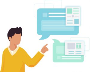
Get It Done With Us
Lorem ipsum dolor sit amet, consectetuer adipiscing elit, sed diam nonummy nibh euismod tincidunt ut laoreet dolore magna.
Content Management
Lorem ipsum dolor sit amet, consectetur adipiscing elit. Vivamus id felis odio. Vestibulum id ligula vitae enim.
Data Management
Lorem ipsum dolor sit amet, consectetur adipiscing elit. Vivamus id felis odio. Vestibulum id ligula vitae enim.
Community Management
Lorem ipsum dolor sit amet, consectetur adipiscing elit. Vivamus id felis odio. Vestibulum id ligula vitae enim.
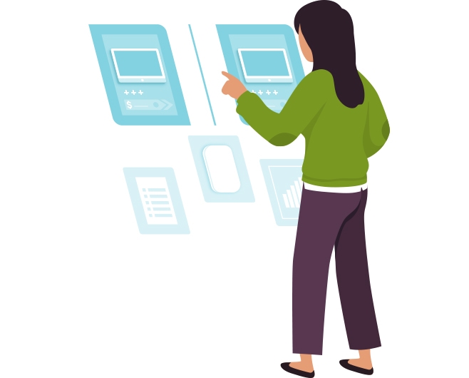
Analyze Financial Data
Lorem ipsum dolor sit amet, consectetur adipiscing elit, sed do eiusmod tempor incididunt ut labore et dolore magna aliqua. Ut enim ad minim veniam, quis nostrud exercitation ullamco laboris. Duis aute irure dolor in reprehenderit in voluptate velit esse cillum dolore eu fugiat nulla pariatur.
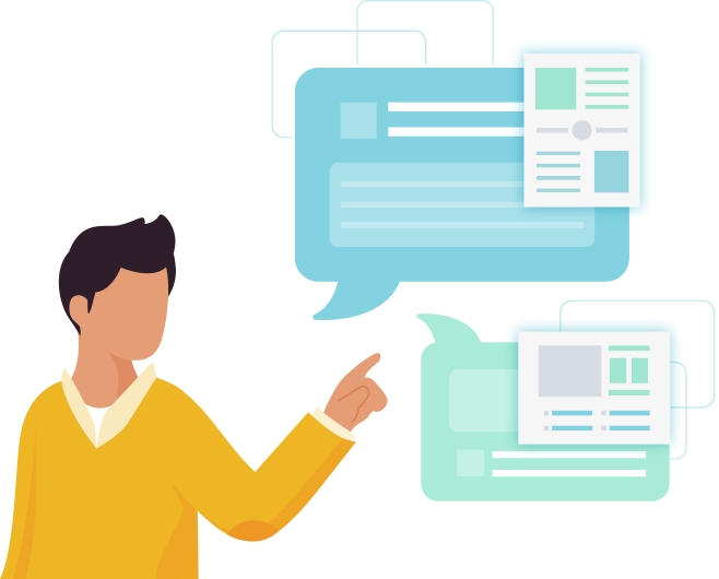
Build a Stronger Relationship with Your Customers
Lorem ipsum dolor sit amet, consectetur adipiscing elit, sed do eiusmod tempor incididunt ut labore et dolore magna aliqua. Duis aute irure dolor in reprehenderit in voluptate velit esse cillum dolore eu fugiat nulla pariatur. Excepteur sint occaecat cupidatat non proident.
Managing Your Business Doesn’t Have to Be Hard.
Lorem ipsum dolor sit amet, consectetur adipiscing elit, sed do eiusmod tempor incididunt ut labore et dolore magna aliqua. Ut enim ad minim veniam, quis nostrud exe.
"Cras malesuada fermentum sollicitudin. Ut at nunc ut lectus interdum consectetur et quis erat. Etiam vel lacus ex."
– Ali Sayed